


Create your own HTML tag using JavaScript
An overview of web components using custom elements


The standard HTML specification provides us with various elements/tags with different purposes and usage. From a <p> tag to insert text to <script> tag to manipulate the document, these elements have been serving most of the purpose needed in a web document for a long time and necessary changes and additions have been continuously done in the specification.
However, the modern web is too advanced to be limited in a set of elements in order to render UI. Web applications these days require customized components, with unique functionalities and appearance. To overcome this issue, W3C has created the web components spec which allows web developers to create new HTML tags or beef up existing tags to their need using Custom Elements.
Now you may notoriously say,
Bruh! I can already write HTML with whatever tag names I want :)
Yeah, you're right up to some extent, just open up your favorite text editor write opening and closing tags with whatever hell name you want like:
<cool></cool>
Attach some event listeners to it, test them in a browser, and boom it works. 👍
Who cares about valid HTML these days right?
That just creates an inline element using the HTMLUnknownElement interface and there's nothing much else you can do with it. On the other hand, custom elements are not just about writing HTML tags with your own names. Using Custom Elements API you can define the behavior of that element, render any markup attach lifecycle events, provide its methods and properties eventually creating its own different API.
Okay, but why? 😕
Custom Elements provide a web standard way of creating reusable and encapsulated components without needing any dependencies or libraries. In the context of a bigger application, the same component we created may be used multiple times and sometimes we may also want to use the same element in a different project or share it. If we're following the traditional way then it means duplicating the same block of code multiple times and it directly goes against one of the major software engineering principles DRY Don't Repeat Yourself.
Whereas in the case of Custom Elements it is just about writing the HTML tag again when the definition is done once. Not only that Custom Elements recommends using the Shadow DOM which completely encapsulates the whole markup, styles and javascript of the custom element from the main DOM and they do not affect each other. More on that later!
We can make use of the same thing SPA like React provide for modularity of UI in the web standard itself which works in majority of the web browsers out of the box. In addition to that we can make use of Custom Elements in any project using SPAs or frontend frameworks like React, Angular, Vue etc. In this way we can even share components across projects using different tech stacks.
Defining Custom Element
customElements global available in the browser can be used to register new HTML Element using the define method which takes the name of the tag to be used in markup and the constructor of class which defines the implementation of that element as arguments. The class provided should be a subclass of the HTMLElement class which provides the all the API necessary to create a custom HTML element. In this way the custom element is added to the CustomElementsRegistry of the browser using which browser recognizes occurrence of tag in HTML file as a valid HTML syntax.
In this tutorial we will explore web components by creating a Collapsible Accordion component, for which the element definition would be:
class CollapsibleAccordion extends HTMLElement {
    constructor() {
        super();
    }
}

customElements.define('collapsible-accordion', CollapsibleAccordion);
And can be used inside the HTML file which imports the above js like:
<!DOCTYPE html>
<html lang="en">
    <head>
        <meta charset="UTF-8" />
        <meta http-equiv="X-UA-Compatible" content="IE=edge" />
        <meta name="viewport" content="width=device-width, initial-scale=1.0" />
        <title>Custom accordion tag</title>
  </head>
    <body>
        <collapsible-accordion></collapsible-accordion>
        <script src="./main.js"></script>
    </body>
</html>
Here you may have noticed the tag name is kebab cased i.e separated by hyphen( - ) which is a w3c recommendation to distinguish custom elements with standard HTML elements. HTML standard is continuously evolving and even though the elements we define now are not standard HTML elements they may be in the future. HTML follows single word semantics for tag names and following kebab case for custom elements avoids chances of collusion.
If we open up the above HTML file in the browser we do not find any changes as the element has no content yet. As the class is extending HTMLElement we have access to every method and properties of HTMLElement class i.e we can use appendChild() or innerHTML to insert content for the element. This will however insert HTML nodes in the same DOM as the element and we will be unable to achieve encapsulation as mentioned earlier. So,

Shadow DOM
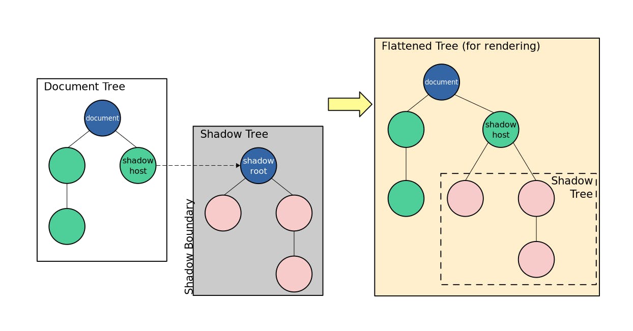
As described earlier, one of the most important and useful features of custom elements is to be able to keep markup structure, style definitions, and its behavior i.e javascript separately without interfering with other parts of the page even if the declarations and naming are the same. Document Object Model (DOM) represents the HTML document in a tree structure with parents and child nodes of HTML elements. Code for any part of the document can directly affect any other part of the tree which defies the custom elements specification of encapsulated components.
To deal with it Shadow DOM is used which is not scary as it sounds but is just a hidden DOM that can be attached to any node in the regular DOM as a subtree. Shadow DOM starts with a Shadow Root underneath which any elements can be attached similar to a regular DOM tree. This encapsulates all the code in the subtree from outer DOM and changes in it do not affect the outer DOM.
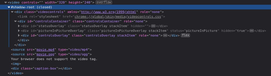
If you're not familiar with Shadow DOM already it is not a new thing but has been used by browsers for a long time. The most commonly seen one is in the HTML video element.
When we inspect the <video> element we see only the video tag as all the components rendered in the UI like the play/pause button, progress bar, etc are hidden inside the Shadow DOM. Which you can see after configuring Developer Tools settings to show user agent Shadow DOM.
HTMLElement provides attachShadow method which attaches shadow DOM to the respective node which in this case will be the custom element.
 constructor() {
     super();
     this.attachShadow({ mode: 'open' });
 }
The key mode of the object passed to attachShadow defines whether the Shadow DOM can be accessed from outside of Shadow DOM or not. Here passing open means we can access the shadowRoot in JavaScript from the main DOM context using Element.shadowRoot and passing mode: 'closed' does the opposite.
HTML Templates
HTML Content Template mechanism provides <template> element which allows defining HTML which will be processed and validated by parser while loading, however, does not get rendered immediately and instead gets stored as a fragment which can be instantiated gradually during runtime. It is another primitive API that falls under the web components family and is generally used as a placeholder for the structure of the custom element. To render it we need to grab its content and append it to the DOM.
The usage of <template> can be further enhanced by using the <slot> element to provide flexibility in the template. Slot Element as the name suggests allows insertion of any other element inside the template while using the template content. While creating the slot element is provided a unique name attribute to be used while inserting elements.
<slot name="value"></slot>
In order to insert any element in place of a slot slot attribute with the name of the slot as the value should be provided in the element to be inserted.
<p slot="value">99</p>
For our tutorial let's create the template for the accordion element and insert it in the shadow DOM.
const template = document.createElement('template');
template.innerHTML = `
<style></style>
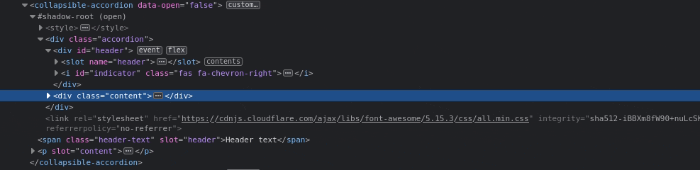
<div class="accordion">
<div id="header">
<slot name="header"></slot>
<i id="indicator" class="fas fa-chevron-right"></i>
</div>
<div class="content">
<slot name="content"></slot>
</div>
</div>
`;
Here a template element is added in the HTML document which holds structure for the accordion element with a style tag which will hold encapsulated styles for components as it will be added inside Shadow DOM. Two slots are created for header and content which can be provided any single or nested valid HTML.
Let's import stylesheets for font and icon inside <head> of main HTML file,
    <link
    rel="stylesheet"
    href="https://cdnjs.cloudflare.com/ajax/libs/font-awesome/5.15.3/css/all.min.css"
    integrity="sha512-iBBXm8fW90+nuLcSKlbmrPcLa0OT92xO1BIsZ+ywDWZCvqsWgccV3gFoRBv0z+8dLJgyAHIhR35VZc2oM/gI1w=="
    crossorigin="anonymous"
    referrerpolicy="no-referrer"
    />
    <link rel="preconnect" href="https://fonts.gstatic.com">
    <link href="https://fonts.googleapis.com/css2?family=Open+Sans&display=swap" rel="stylesheet">
Provide the template some styling,
  <style>
    *{
      font-family: 'Open Sans', sans-serif;
    }
    #header{
      display: flex;
      justify-content: space-between;
      padding: 15px 20px;
      background-color: #edece8;
      border: 1px solid #404040;
      border-radius: 4px;
      cursor: pointer;
      margin-bottom: 10px;
    }
    .content{
      margin-left: 20px;
      display: none;
    }
    .content-active{
      display: block;
    }
  </style>
And finally, append it to the Shadow DOM of <collapsible-accordion> i.e our custom element:
this.attachShadow({ mode: 'open' }).appendChild(
    template.content.cloneNode(true)
);
Here the template node is deeply cloned i.e along with its whole subtree by passing true in cloneNode method as an argument. The clone is then appended to the shadowRoot.
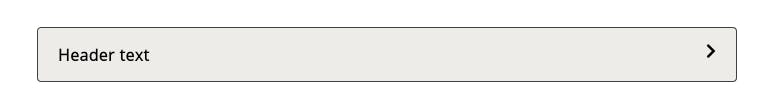
Now as we've provided a template for the custom element with two slots, in order to use the <collapsible-accordion> element properly we must provide elements to fill those slots.
<collapsible-accordion>
  <span slot="header" class="header-text">Header text</span>
  <p slot="content">
    Nisi anim eiusmod elit laborum deserunt nisi veniam. Magna aute aliquip
    nulla id voluptate eiusmod tempor ipsum. Aute eu consequat nisi sint
    aliquip anim id adipisicing veniam. Ut deserunt labore laboris laboris
    nostrud proident excepteur quis duis cillum. Dolor voluptate irure non
    aliquip irure quis incididunt aliquip exercitation est ipsum ut irure
    commodo.
  </p>
</collapsible-accordion>
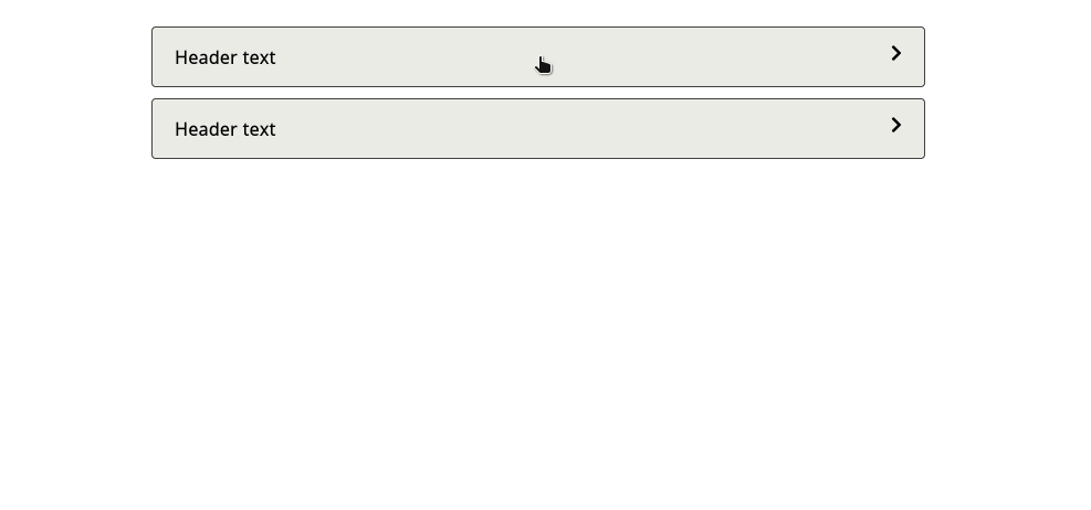
So far, we have successfully created a custom accordion element and rendered it in the browser with provided header text.
But we haven't defined the behavior of the element yet so as the accordion is collapsed by default we are unable to open and close it.
Lifecycle Callbacks
Custom element class allows to define several callbacks/hooks which get fired at different points of the element's lifecycle. Lifecycle methods range from ones getting fired on elements getting attached to DOM to change in properties to getting fired on the removal of elements from DOM.
Among which we will use connectedCallback method which gets called each time the custom element is appended into an element that is connected to DOM. We use this callback to define the behavior of our custom element which is to open and close the accordion on click.
connectedCallback() {
  this.setAttribute('data-open', false);

  const styles = document.querySelector('link[href*="font-awesome"]');
  if (styles) {
    this.shadowRoot.appendChild(styles.cloneNode());
  }

  const header = this.shadowRoot.querySelector('#header');
  const content = this.shadowRoot.querySelector('.content');
  const indicator = this.shadowRoot.querySelector('#indicator');

  header.addEventListener('click', () => {
    content.classList.toggle('content-active');
    if (this.getAttribute('data-open') === 'false') {
      this.setAttribute('data-open', true);
      indicator.classList = 'fas fa-chevron-down';
    } else {
      this.setAttribute('data-open', false);
      indicator.classList = 'fas fa-chevron-right';
    }
  });
}
Here, a data attribute data-open is used to identify whether the accordion is open or collapsed. Initially, it is set to false as the accordion is collapsed on the first load by default. In order to show and hide content display style property is toggled using content-active class accordingly and the chevron is changed similarly on each click event on the header of accordion.
Also here a click event is registered for the header of the custom accordion element it is a good practice to clean up an event listener by using removeEventListener before the custom element is removed from the document. In this case disconnectedCallback lifecycle method should be used.
Show me the demo 🤖
Wrapping Up 🎁
CustomElements API & Web components specification is far more capable than just creating some custom HTML tags. We can create complex components with advanced features according to need using it. All the major modern browsers support the specification & for those who do not support Shadow DOM, HTML Templates, etc polyfills are available. The ability to use techniques used by popular SPAs out of the box in the browser without the need to carry a heavy load of library code is astonishing and certainly, web components are the future of the web!
However, by embracing the web components technology the development experience and tooling can further be enhanced by using libraries based on it like Lit, LitElement, Stencil, Slim.js etc.
Below are some important resources if you want to explore web components further:
- webcomponents.org => Home of web components
- MDN => Tutorials & references on web components and the technologies involved
- Google Develoopers => Detailed guide to Custom Elements v1 & Shadow DOM v1 (Recommended by W3C)
You can find the complete codebase of this tutorial inside Accordion folder of the following repo:
Well, that's all folks. Hope you liked it! See y'all in the next one.